Little Big Details For Your Mobile App
by Nick Babich让你移动APP脱颖而出的小细节
让你移动APP脱颖而出的小细节
你应用程序的成功,基于很多因素,但总的来说,用户体验还是最重要的。一个能在市场上脱颖而出的应用,用户体验一定很棒。对移动端产品的用户体验来说,追求最佳的体验是一条非常可靠的方法。在整体产品设计的时候,我们往往很容易忽略一些看起来很好,但又感觉不必要的设计元素。然而,好的与惊人的用户体验之间的区别往往就在于我们这些贴切的小细节的设计。
Your app’s success is based on a combination of factors, but the overall user experience tops them all. The apps that stand out in the market are those that deliver great UX. When it comes down to designing for mobile UX, sticking to best practices is a solid way to go, but during the creation of the big picture it’s fairly easy to skimp over design elements that feel like nice to have but not necessary. However, the difference between creating good experiences and amazing experiences often comes down to how thoughtful we can design these small details.
在这篇文章里,你会明白,为什么说这些小细节的设计与很多显著的设计元素一样重要,这些小细节的设计,同样决定着你的应用的成功
In this article you’ll see why these little big details are just as important as the more obvious elements of your design, and how they help determine the success of your app.让你移动APP脱
启动页
Slash Screen
当用户打开 app 时,最不能做的事情就是让他们等待。但是如果 app 的初始设置非常耗时,又不可能优化该怎么办?你不得不让用户等。如果他们愿意等,你得知道如何 吸引他们。启动页解决了等待的问题,让你有一个简洁有力的窗口来吸引用户。
When a user launches your app, the last thing you want to do is tell them to wait. But what if your app has a time-consuming initial setup phase and there’s impossible to optimize this step? You have to ask users to wait. And if they should wait, you should figure out how to engage them . A splash screen solves the waiting problem and gives you a short but vital window to engage a user in your proposition.
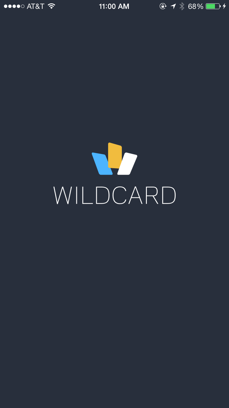

这里有一些小贴士,在设计启动页的时候记得注意:
Here’s a few tips to keep in mind when you’ll design a splash screen:
Google 和 Apple 都建议用启动页 模拟更快的加载 来提高用户体验。启动页给到用户即时反馈,表示 app 已经启动并正在加载。 为了保证人们等待的时候不厌倦,给他们一些 娱乐:有意思的,意想不到的,或者任何可以抓住用户注意力的东西,时间长到够 app 启动就好。
Both Google and Apple suggest to use the splash screen to improve the user experience by simulating faster loading times . Splash screen gives the user immediate feedback that the app has started and is loading. To ensure people don’t get bored while waiting for something to happen, offer them some distraction: something fun, something unexpected or anything else that catches your users’ attention long enough for your app to load.
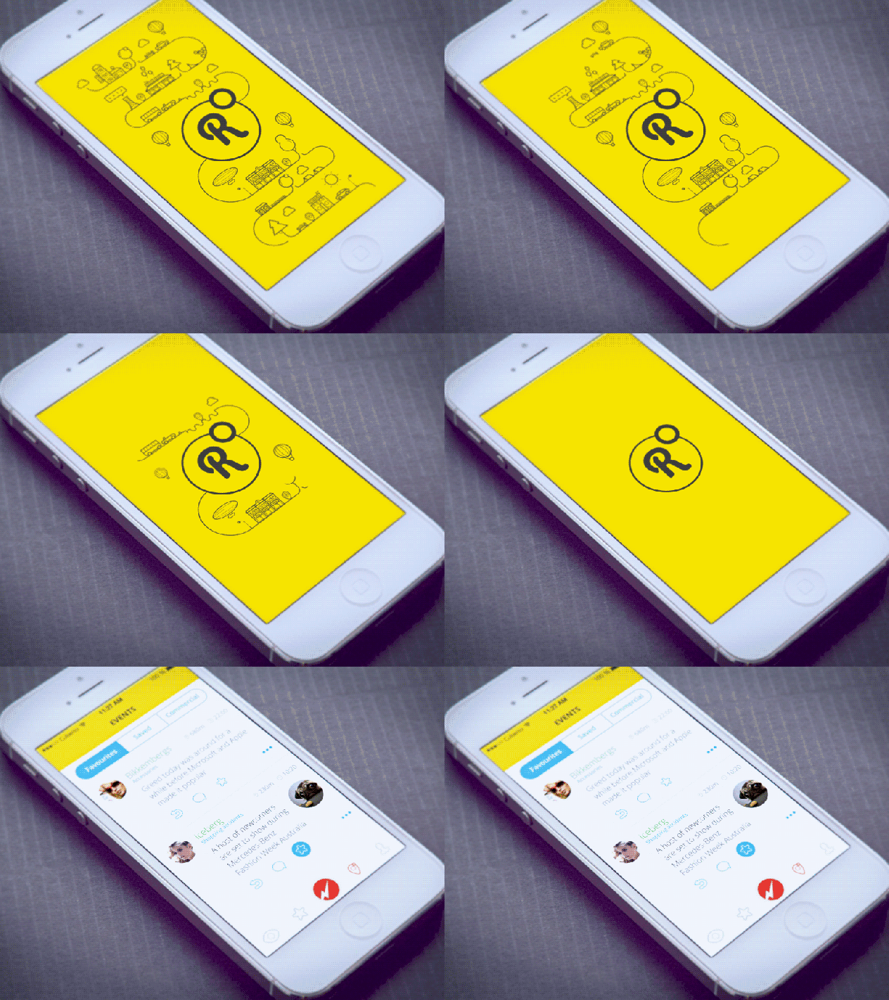
如果 app 的初始设置超过 10 秒钟,考虑使用 进度条 来表示正在加载。记住,不确定时间的等待给人的感觉要比确定时间的等待更加漫长。所以,你要给用户一个清晰的标识,他们需要等多长时间。
If your app has a initial setup phase, which takes more than 10 seconds, consider usingprogress indicators to show that loading is in progress. Keep in mind that uncertain waits are longer than known, finite waits . Thus, you should give your users a clear indication of how long they need to wait .
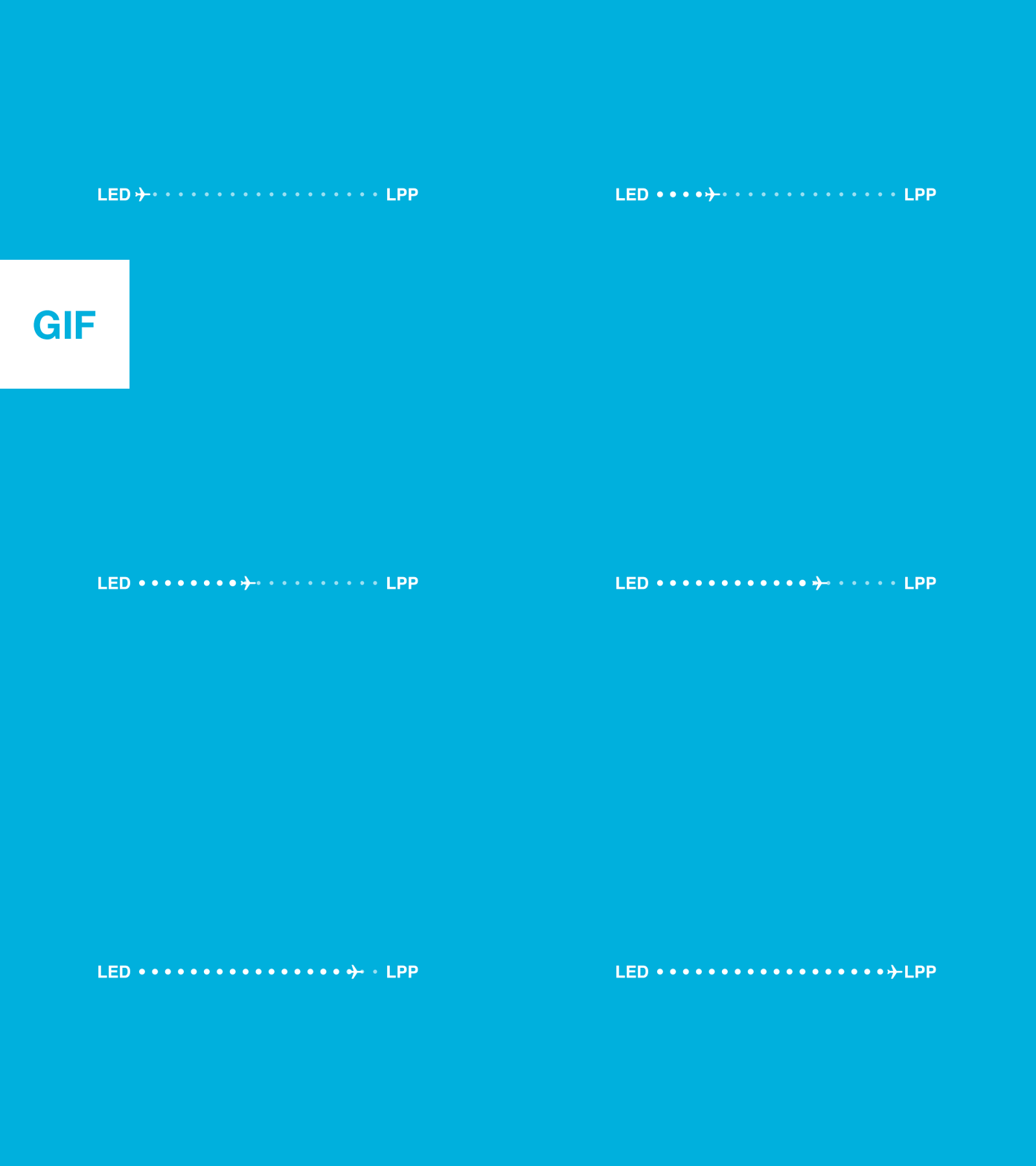
Make the loading process feel natural by using progress bars.
通过使用进度条让加载过程更自然
让你移动APP脱颖而出的小细节
空状态
Empty States
我们通常会设计一个丰满的界面,布局中的所有元素都完美的放置,看上去很美。但是如果界面正在等待用户操作,该怎么设计?我要说的就是空状态。设计空状态是非常重要的,因为即使它是一个临时状态,它也会是 app 中的一份子, 并且对用户 有用。
空状态的意义不仅是一个装饰。除了向用户提示界面上将要展现的内容,它还可以作为一种 导引 (介绍 app,展示为用户做的事情),或者 助手 (出错时的屏幕)。这两种情况下,你都希望用户能做点什么事情,所以,屏幕不会立即变为空状态。
做好这4个细节设计,让你的移动APP 用户体验脱颖而出
We normally design for a populated interface where everything in the layout perfectly arranged and looks great. But how should we design our screen when it’s pending user action? I’m talking about empty (or blank) states . Designing an empty state is a very important moment, because even it’s meant to be just a temporary stage it should be a natural part of your app and be helpful for your users.
The purpose of a empty state is more than a just decoration. Besides informing the user about what content to expect on the page, empty states can also act as a type of onboarding (they introduce the app and demonstrate what it does to your users) or helping hand for your users (the screen when things go wrong). In both cases, you want your users to do something so that the screen wont’ be empty as soon as possible.
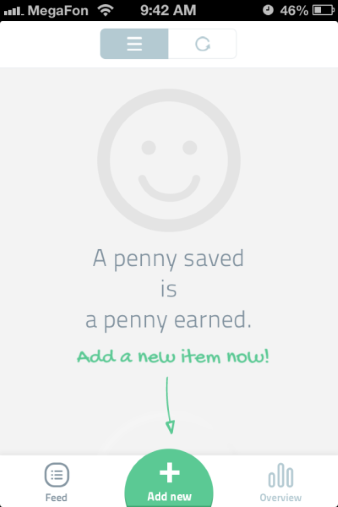
下面是一些设计空状态时的小技巧:
Here’s a few tips to keep in mind when you’ll design an empty state:
给新手用户设计空状态。记住新用户的体验很 重要。给他们设计空状态的时候要尽量简单。重点放在用户的主要目标,设计互动性最大化:清晰的信息,合适的图像,一个按钮,这就够了。
做好这4个细节设计,让你的移动APP 用户体验脱颖而出
Empty state for a first-time user. Remember that first time user experiences should be focused . When designing empty states for a first-time users, keep them as simple as possible. Focus on primary user goals and design for maximum interactivity : clear message, right imagery, and a action button is everything you need.
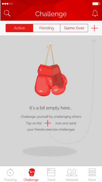
Khaylo Workout 是一个关于空状态设计的很好例子。这个空状态告诉用户为什么会看到当前界面(因为他们还没有挑战任何朋友)以及如何操作(点击 + 图标)
Khaylo Workout is a great example of a proper empty state design. This empty state tells users why they see it (because they haven’t challenged any friends) and how to fix it (tap the ‘+’ icon). Image credit: emptystat.es
错误状态。如果空状态时由于系统或用户错误,你必须在友好度和帮助度之间寻找一个平衡。一点小幽默通常可以抹平出错的沮丧,但是更重要的是你要清楚的说明解决问题的步骤。
Error state. If the empty state was due to system or user error, you must find a balance between friendliness and helpfulness. A short sprinkling of humour is often a great way to diffuse the frustration of an error, but it’s more important that you clearly explain the steps to solve the problem.
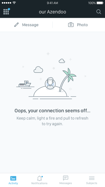
迷失方向,孤立无援,就像在一个荒岛上?遵从 Azendoo 的建议,保持冷静,点个火,然后继续刷新。
Feel lost and unconnected, like you are on a deserted island? Follow the advice from Azendoo, keep calm, light a fire, and keep refreshing.
让你移动APP脱颖而出的小细节
框架界面
Skeleton Screens
Feel lost and unconnected, like you are on a deserted island? Follow the advice from Azendoo, keep calm, light a fire, and keep refreshing. Image credit: emptystat.es
Skeleton Screens
我们通常不考虑内容的不同加载速度——我们一直认为都是立马加载(或者至少非常快)。所以我们通常没有为用户需要等待加载的场合设计。
We don’t usually think about different loading speeds for our content — we believe that it loads instantly (or at least very quickly) all the time. So we don’t usually design the uncomfortable moments when users must wait for content to display.
但是网速不是总是有保障的,它可能比预期的要慢。尤其是下载比较大的内容时(比如图片)。如果你不能缩短时间,至少要让用户等待得舒服一点。你可以用临时信息容器 来保持用户的注意,比如框架界面和图片占位符。比起转圈的加载提示,框架界面能建立对内容的预期,减少认知的负担。
But internet connection speeds aren’t always guaranteed and actions can take longer that expected. This is especially true when heavy content (such an images) is downloading. If you can’t shorten the line you should at least try to make the wait more pleasant for your users. You have a great opportunity to keep users engaged by using temporary information containers , such as skeleton screens and image placeholders. Rather than show a loading spinner, skeleton screens create anticipation of what is to come and reduce cognitive load.
让你移动APP脱颖而出的小细节
几点建议:
Here are a few tips for your design:
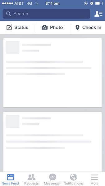
框架界面不必很抢眼。只需要凸显必要的信息,比如段落结构。Facebook 的灰色占位符就是个好例子——它加载时使用了元素模板,让用户熟悉正在加载的内容的整体结构。注意框架界面中的图片和线框并没有很大区别。
The load screen doesn’t need to be eye-catching. It should highlight only necessary information such as structure of the sections. Facebook’s gray placeholder is a good example — it uses template elements when loading content and makes the user familiar with the overall structure of the content being loaded. Notice that images used in skeleton screen aren’t drastically different from wireframes
对正在加载的图片,可以用图片中的主色填充一个占位符。 Medium 有一个很棒的图片加载效果。首先载入一个小的模糊图片,然后慢慢转变成大图。
For a loading image you can use a placeholder filled with the predominant color of the loading image. Medium has a nice image loading effect. First, load a small blurry image, and then transition to the large image.
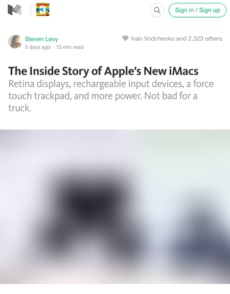
真正的图片出现之前,你可以看到模糊图片填充的占位符
Before the actual image appears, you can see a placeholder filled with the blurry image.
让你移动APP脱颖而出的小细节
动画反馈
Animated Feedback
好的交互设计会提供反馈。在现实世界,像按钮这样的物体会对我们的交互做出反馈。人们会对 app 中的元素有同样水平的期望。可视的反馈让人们有 掌控感:
Good interaction design provides feedback. In the physical world, objects like buttons respond to our interactions with them. People expect a similar level of responsiveness from app elements. Visual feedback makes users feel in control :
它会告知交互的结果,让结果可见并可以理解。
It communicates the results of any interaction, making it visible and understandable.
它给用户一个信号,这个对象(或者 app )执行一个任务成功或者失败。
动画反馈通过即时的信息沟通来节约时间,并且不能让用户厌烦或者分心。最基础的动画反馈就是 转场:
It gives the user a signal that they (or the app) have succeeded or failed at performing a task.
Animated feedback should save time by instantly communicating information in a way that doesn’t bore or distract the user. The most basic use of animated feedback is in transitions:

当用户看的点击/触摸操作引发的一个动画反馈,他们马上知道这个操作被接受了。
When users see an animated feedback triggered by click/tap action, they instantly know the action was accepted.
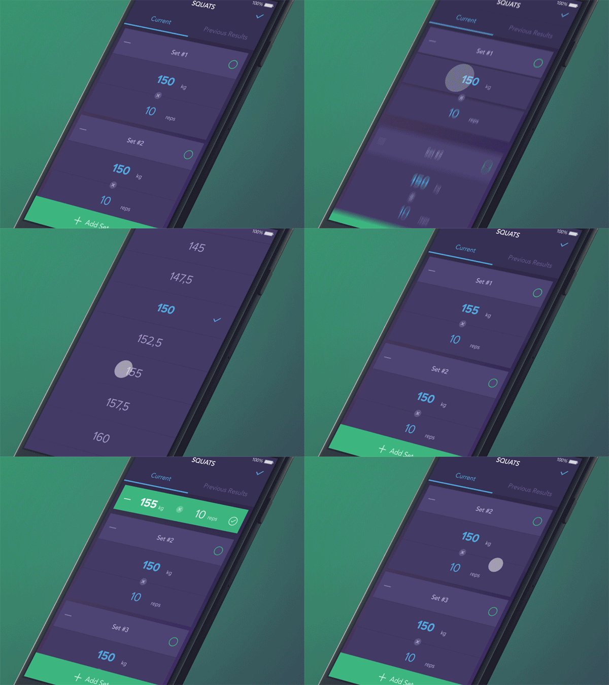 当用户点击勾选任务已完成, 包括这个任务的区域就缩小并且变成了绿色。
When user checks the box to indicate that the task is complete, the block containing this task shrinks in size and changes its colour to green.
but an app can truly delight a user whenanimation is used in ways beyond the standard scope of actions.
下面是关于动画反馈的一些提示:
Here are a few tips and things to remember for animated feedback:
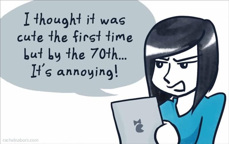
动画反馈必须经久不衰。第一次看着新鲜的东西,100 次之后可能就烦了。
Animated feedback must survive long-term use . What seems fun the first time might become annoying after the 100th use.
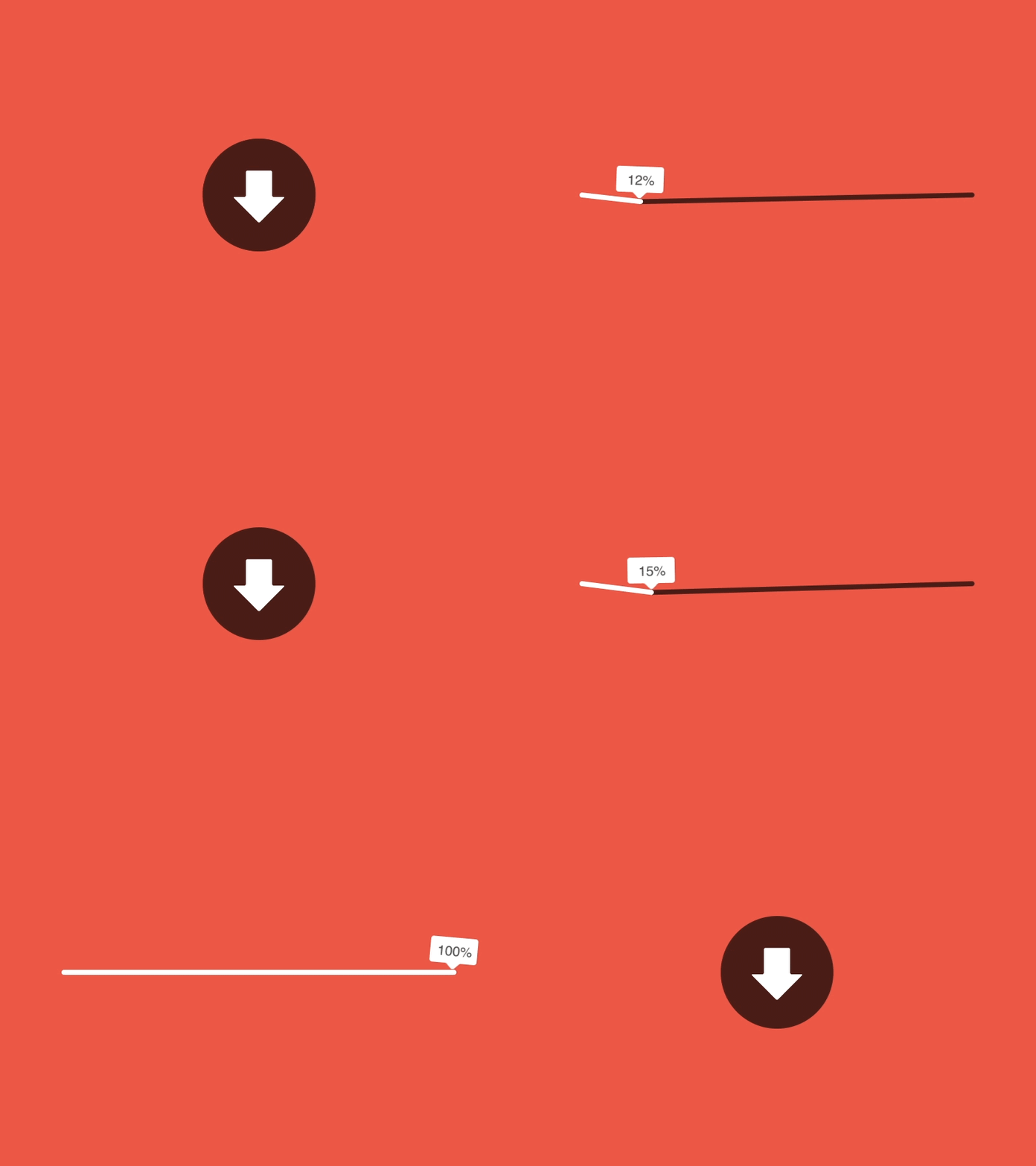 动画可以让用户分心,让他们忽略加载的时间。
Animations can distract your visitors and make them ignore long loading times.
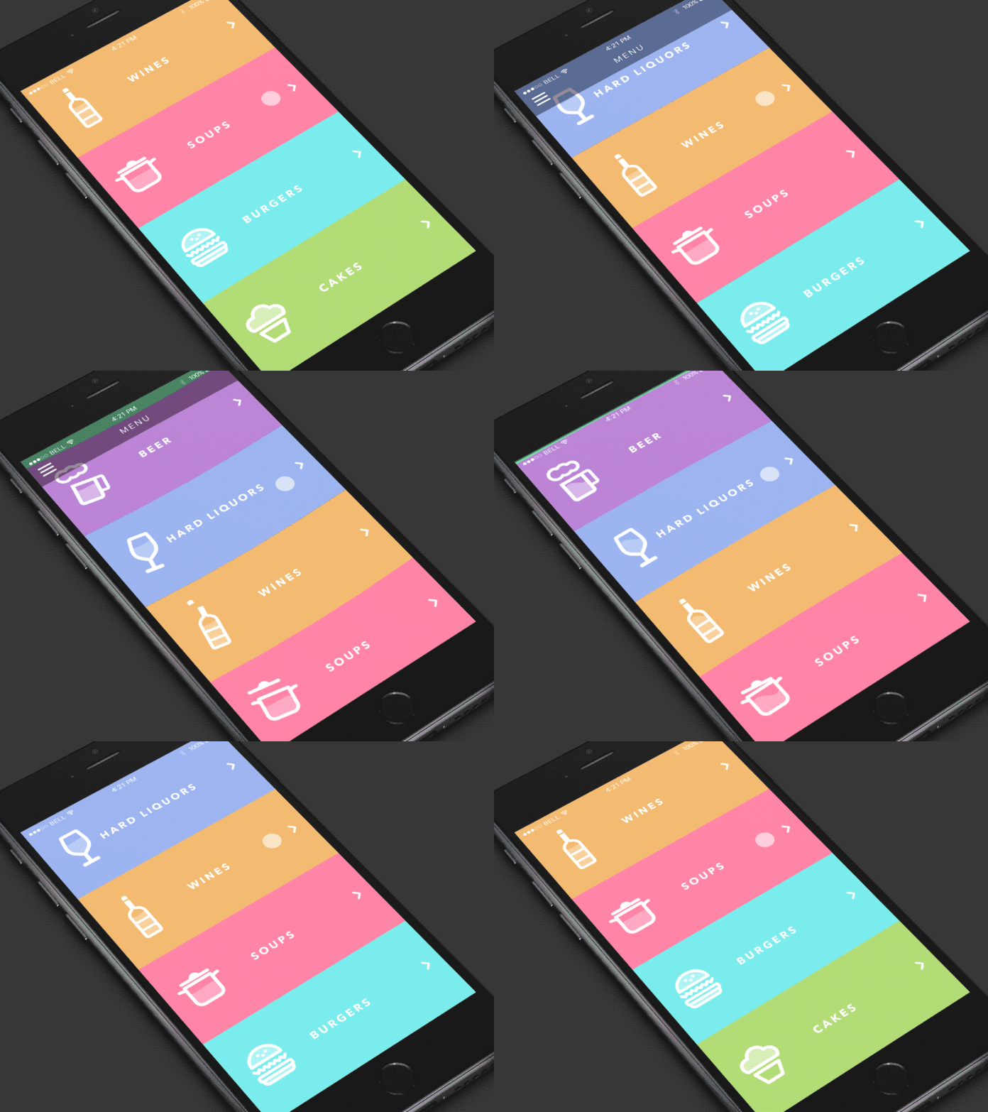 动画可以让用户体验打动人心,刻骨铭心。
Animation can make your user experience truly delightful and memorable
总结
Conclusion
用心设计。app 的 UI 里面,每个微小的细节都值得密切注意,因为 UX 就是让所有细节协调的总和。所以,请从一而终,持之以恒的打磨你的 UI,创造真正无与伦比的用户体验。
Design with care. Each minor detail in your app’s UI deserves close attention, because UX is the sum of all details working harmoniously. Thus, polish your UI from A to Z in order to create really amazing user experience
Thank you!
